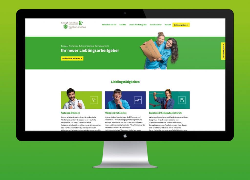


The Berlin hospital association of St. Joseph Krankenhaus Berlin Tempelhof and Franziskus-Krankenhaus Berlin wanted a uniformly designed appearance in its external and internal communication – as an employer brand.
Task
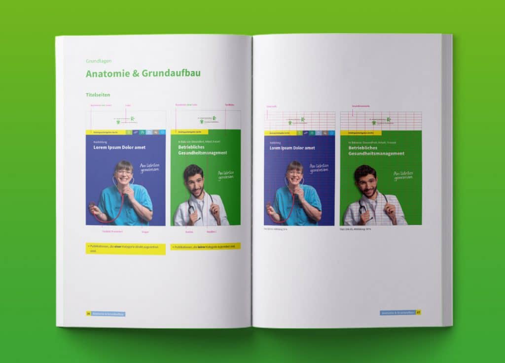
Development of a design manual for the personnel marketing department of St. Joseph Hospital (SJK) Berlin Tempelhof. The cross-media concept was to cover the areas of digital and print. It should work for two target groups: for the client as internal identification and in the external effect for applicants and job seekers.
Concept
A design manual must be based on the corporate design and appear authentic. It must function according to the client’s wishes and meet their requirements in terms of content and design.
Digital and print
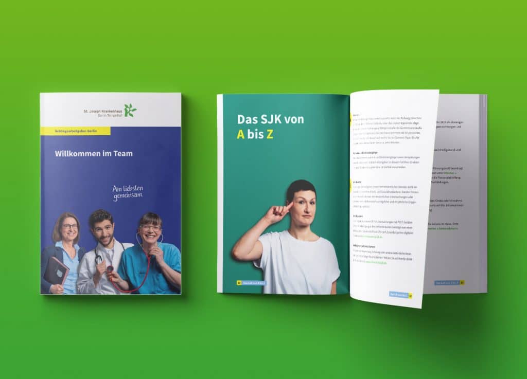
In addition to digital platforms, there should also be print products. The personnel marketing design manual was designed as a clear and practical A4 publication. The smaller welcome brochure was published in a handy A5 format and the structure is more service-oriented. Each employee receives their own copy. This is almost old-school in this form and is therefore particularly appreciated.
Implementation
A design manual must reflect what the customer is all about so that it appears authentic and those who are to use it can also find themselves reflected in it. This ultimately increases the willingness to implement and apply the concept. For this to succeed, you need a good feel for the customer, which can only be gained through a real exchange. Time invested here is always a gain.
In this case, we accompanied and experienced the employees at the photo shoot and sensed that these are young and dynamic people who enjoy working together. That is why the parameters of joie de vivre, young people and teamwork can also be found in the design.
Result
The design mainly uses shades of green and blue, with bright yellow used sparingly for accents. The overall impression is friendly without appearing artificial. This is largely due to the fact that the photos were taken with real employees. The design is clear and concise to make it as easy as possible for the user. A paper quality was chosen for the printed products that is pleasant to the touch but also durable.
More about the development process in the interview with the UVA art director