

Vivantes wanted to further develop its brand values so that they would not only be seen but also felt—both externally and internally. As one of Germany’s largest municipally owned hospital groups and an integral part of Berlin, Vivantes needed a brand identity that would convey its character, values, and close connection to the city at first glance.
Task
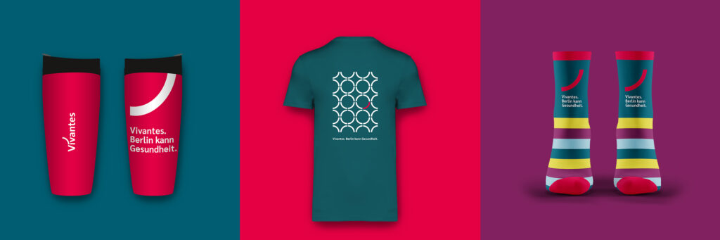
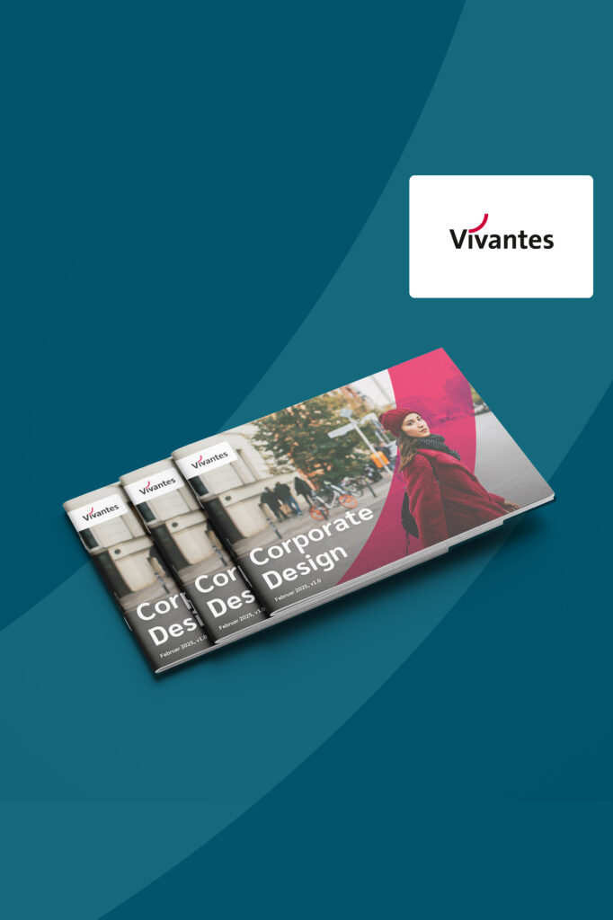
Our mission: to create a comprehensive corporate design complete with a wide range of templates—credible, consistent, and thoroughly accessible. The goal: to make the company’s newly defined brand values and character tangible across every channel, from business cards to large-scale campaigns.
Implementation
Over the course of an entire series of workshops, we worked with a large, diverse team from Vivantes to identify what defines the company at its core—with the help of mood boards to guide our decision-making. The biggest challenge: to visually integrate Vivantes so strongly with Berlin that the connection is palpable in every detail—with accessibility in mind from the very first sketch.
Design and Results
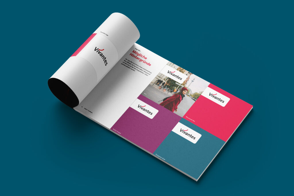
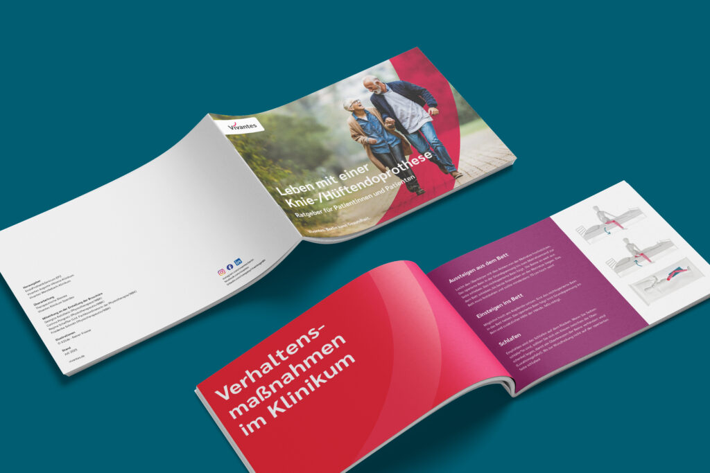
The result is a new color palette that reflects brand values and Berlin’s character—with clearly defined color pairs that create strong contrast. Clear, easy-to-apply guidelines ensure consistency across all formats. A custom-developed visual language with Berlin flair and an iconography featuring over 100 icons round out the urban, distinctive look.