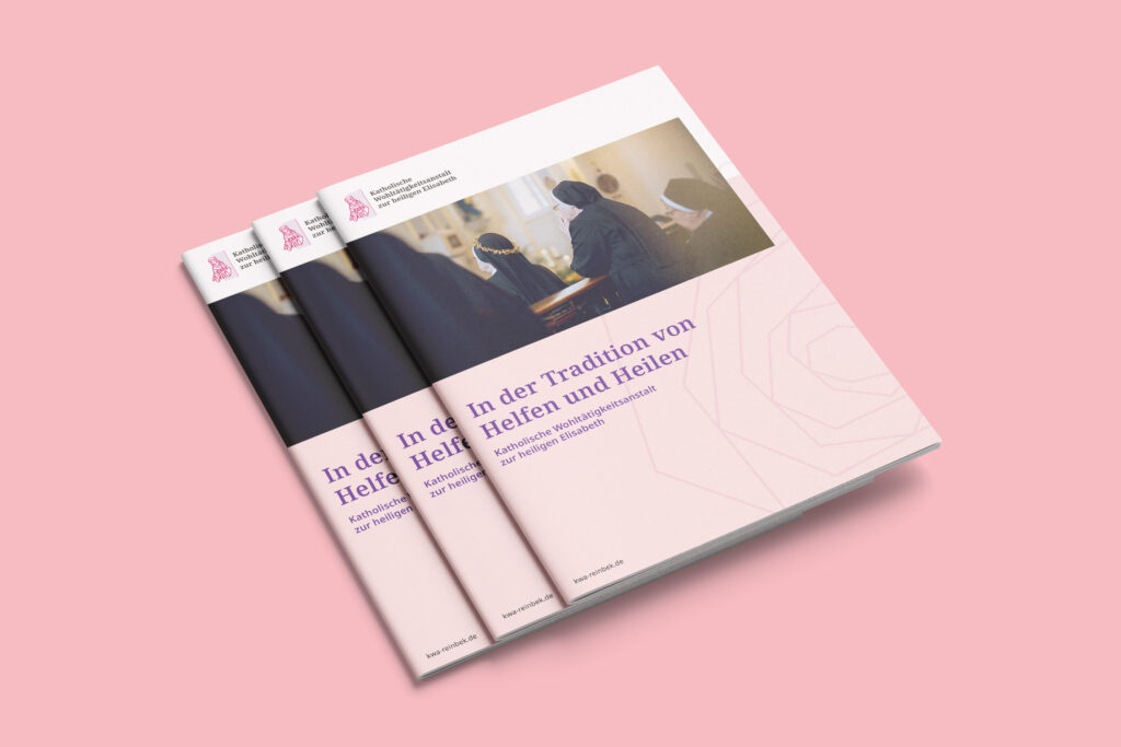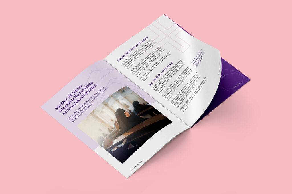


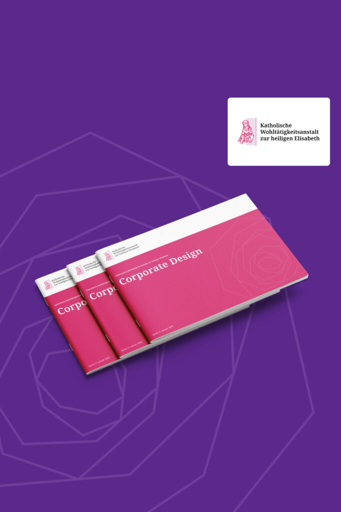
The Catholic Charity of St. Elizabeth (KWA) had a blind spot when it came to visibility. We changed that—with a modern, cohesive brand identity that combines tradition with contemporary design and has been consistently designed to be accessible from the very first sketch.
Task
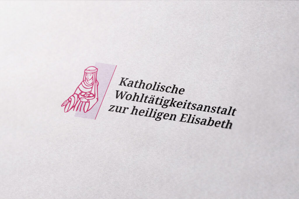
The assignment: a complete overhaul. A modernized logo, clear templates for the most important formats, a new website—and on top of that, a corporate brochure that showcases what KWA is truly capable of. The rule here: implement everything to be accessible and WCAG-compliant, without compromising on a contemporary look.
Implementation
We kicked things off with a workshop—mood boards, discussions, and the search for the right visual direction, all in collaboration with KWA. The biggest challenge: creating a modern visual identity that respects the organization’s long tradition rather than overshadowing it. At the same time, we ensured that every design and color decision was WCAG-compliant from the very beginning—accessibility wasn’t an afterthought, but an integral part of the concept.
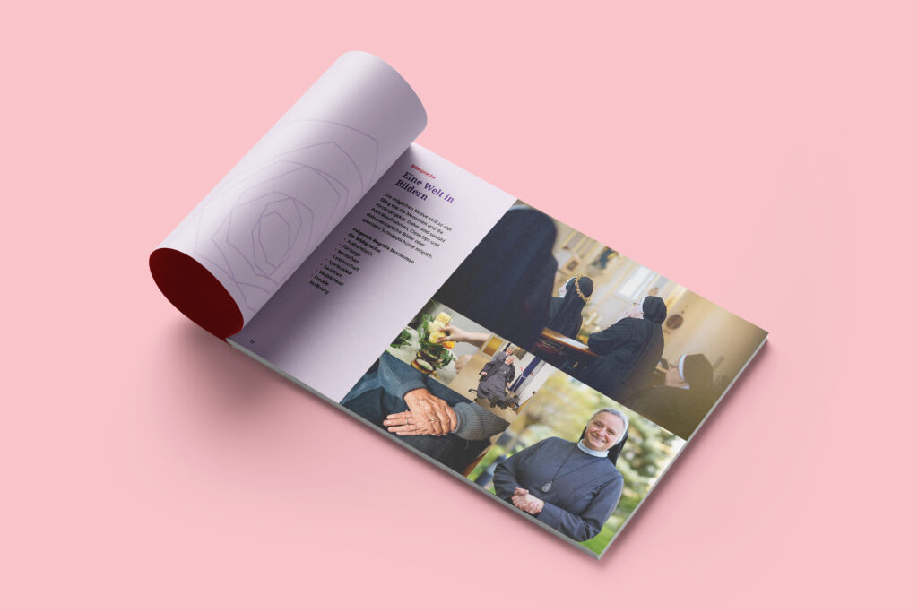
Design and Results
The new corporate design features bold primary colors—red and purple—combined in accessible color pairs with strong contrast. A mix of serif and sans-serif typefaces blends tradition with modernity. Clear, easy-to-apply design guidelines ensure a consistent visual identity—from the updated logo to the new corporate brochure.